CALL US TODAY: (877) 786-3249 x3
Schedule a Strategy Session

Your B2B website can be search engine optimized, have a top-of-the-line design, show up in top search engine ranks, and have numerous quality back links, but all of those online marketing tactics cannot help you if a customer reaches your homepage and it does not effectively communicate the key benefits and information they need to convert. Here are 5 elements that are essential when creating a website to make sure that your homepage is built to convert visitors.
A successful homepage tells the visitor what a company has to offer in the first 5 seconds. When customers visit your homepage they are only going to spend a little amount of time searching to see what it is that you do and whether you can help them. A tagline and headings are often overlooked during website design and branding, but they can make a big impact when drawing customers in.
Think of when you’re at the library and looking for a new book to read. The thing that matters most is the title. If the title doesn’t catch your eye and doesn’t give you some indication of what the book is about, then you are likely to put the book back on the shelf. You don’t have time to read the backs of thousands of books, just like your customers don’t have the time to search for your “back of the book” description. Your homepage needs to have an all-telling tagline at the top and next to the logo, that tells customers exactly what you do in only a few words.
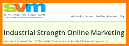 Take our very own homepage as a good example. SVM’s tagline reads “Online Marketing. Bottom-line Results.” This allows customers to see that SVM offers online marketing services right away. Then, right below our logo we feature a large heading that reads “Industrial Strength Online Marketing. Bottom-Line Results for B2B Industrial Companies…” Our tagline and headings make it clear that if you are looking for online marketing and are an industrial b2b company, then our website is a fit. A homepage, through a tagline and headings, serves to get customers to explore the rest of your website.
Too many times websites pick one piece of information they have, whether it be a snippet about their company, a current promotion they are running, or a featured product, and make that the only thing featured on their homepage. But what about all of the things your company has to offer and the variety of customers you have?
Treat your homepage like a first impression. You want to get as much good information about yourself out there, tailored to the person you are meeting, and in a short amount of time (or in this case, space).
Note: Breaking up sections of your homepage using headings also allows you to optimize the homepage for Search Engine Optimization. Remember to use H1 and H2 heading tags with your most important keywords (aka power keywords).
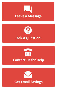 So a customer lands on your homepage, scans the page, but now what? Calls-to action buttons make traveling the website easier so customers who come to your homepage can actually do something, whether it is asking a question, requesting a quote, downloading a resource, or making a purchase. These calls-to-action buttons become a lead capturing process that helps to progress a casual visitor into a lead. Here are a few tips on how to include calls-to-action buttons on your homepage:
Whether it’s new visitors or past customers coming to your website they are likely to have questions. Having a highly visible phone number on the homepage serves two essential purposes.
The best place to have your phone number is in the header, in the color that stands out, in a font size that is similar to a heading, and made clickable for users using mobile technology.
Complete Navigation.
Having a main navigation near the top of the homepage is an expected and common practice used by companies. It effects traffic, SEO, conversions and user-friendliness. However, a lot of times these navigations are not complete. It is common for B2B ecommerce websites to only focus on ecommerce, by having a “Shopping Cart” and “My Account” links in the navigation, while the rest of their pages are hidden away in the footer. Or, websites will include their products and services but forget to include “About Us” or “Contact” links. The main navigation should contain and connect all the important sections of your website making it complete.
Keep it simple and make sure that your visitors are able to locate the necessary information as soon as possible. A good way to assure everything is included is to create a sitemap in the form of an organizational chart that includes all the main sections of your website. This way you have a visual representation of your content and site structure.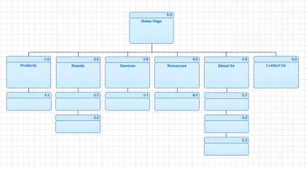
If you do have a lot of ecommerce or self-serving sections of your website, put them in a separate navigation above or below the main navigation so that these sections are also easy to see by visitors. See Valin’s Website as a good example.
Do you need help leveraging your homepage? Learn more about SVM’s website creation services or contact us for more information.

